FINAL NOTES
1. You have zero time to procrastinate. For the next several weeks in class and at home all work needs to be done as if you have a heavy deadline looming…because you do. WORKING EFFECTIVELY AND ‘JUST WORKING’ ARE TWO SEPARATE THINGS.
2. You should be turning in a project for review at least THE START OF EVERY THIRD DAY.
3. ALL PROJECTS SHOULD MEET THE CRITERIA FOR QUALITY.
4. IF you have a project we have done in the past that you might have been happy with the solution or it was heading in the right direction you can bring it to me. IF it has potential you may be able to use that solution if it fits one of the projection. YOU WILL STILL NEED TO REDO THE SOLUTION AND IMPROVE UPON IT but this at least could give you a very strong start in the right direction.
5. MAKE SURE TO STUDY TH E/P SHEETS AS WELL AS YOUR GRADE SHEETS FOR SIMILAR PROJECTS.
6. You have had plenty of time to learn from mistakes. There is no new material here. DO NOT MAKE THE SAME MISTAKES.
7. REMEMBER, THESE GRADES COUNT ON THE 9 WEEKS AS WELL AS TOWARDS YOUR FINAL EXAM GRADE.
8. At the end of the Freshman Review when all work is hung you will receive a final large-scale project dealing with UNITY.
9. YOU MUST HAVE REFERENCE PICTURES FOR ALL PROJECTS TURNED IN WITH THE PROJECTS.
10. ATTENDANCE IS OF UTMOST IMPORTANCE. SNOW DAYS, EARLY RELEASES, NO SCHOOL DAYS HAVE NO EFFECT ON THE DEADLINE AND YOU SHOULD STILL BE WORKING AT HOME ON THESE DAYS.
11. WHEN YOU WORK AT HOME IT STILL NEEDS TO BE WITH A PURPOSE AND IN A QUALITY MANNER.
IT IS ABSOLUTELY IMPERATIVE THAT YOU USE YOUR TIME WISELY, USE PROPER TECHNIQUE, AND EVERY ITEM THAT IS PRODUCED IS HIGH QUALITY AND WOULD WORK IN A PORTFOLIO. While each project holds individual grades there is an OVERALL PASS OR FAIL CRITERIA. Some of you have spent nearly THE ENTIRE 18 weeks not working effectively or ‘smartly’. YOU WILL FAIL DOING THE SAME THING. This work should be able to be completed in 16 days of work and at home. You will however have a total of 25 real time days to have items turned in. STUDENTS WERE GIVEN AN ADDITIONAL WEEK DUE TO SNOW DAYS GIVING A TOTAL OF 32 DAYS TO MEET THE CRITERIA.
Tuesday, February 17, 2009
What is a Quality Product?
I. The main goal in commercial art is to PRODUCE A QUALITY PRODUCT.
II. What is a QUALITY PRODUCT?
A. Meets all the CRITERIA of the project.
B. Is CREATIVE and ENGAGES the viewer.
C. Has HIGH PRODUCTION VALUE.
D. Has PROPER presentation.
E. EFFECTIVELY utilizes the ELEMENTS AND PRINCIPLES OF DESIGN.
III. HOW to PRODUCE a QUALITY PRODUCT
A. UNDERSTAND the INTENT of the scenario.
B. UNDERSTAND ELEMENTS AND PRINCIPLES OF DESIGN with the ability to UTILZE them in CREATIVE AND EFFECTIVE manner.
C. UTILIZE the CREATIVE PROCESS in a THOUGHTFUL manner.
D. EVALUATES solutions in a critical manner to find the BEST SOLUTION that is CREATIVE.
E. PLAN and WORK EFFECTIVELY within the given TIME FRAME.
F. UNDERSTAND PROPER RENDERING TECHNIQUES AND RULES such as the ‘Perception’ chart and HOW MEDIA WORKS AND INTERACTS in achieving desired results.
G. APPLY PROPER RENDERING TECHNIQUES to achieve EFFECTS APPROPRIATE FOR A QUALITY PRODUCT.
H. CUT and MOUNT/DISPLAY work to CRITERIA and that HELPS the work to have HIGH PRODUCTION VALUE.
I. Take CARE of work BEFORE, DURING, and AFTER presentation.
Project 1: Photography
Line

Shape

Steal beams of tower represents shape.
Value

Form

Texture

Color

Space
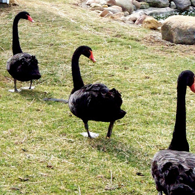
Black Swans represent space.
Movement

Balance

Emphasis

Pattern

Contrast

Rhythm

Unity

You will be required to submit ONE photo that accurately represents each element and principle of design. This does not mean to take only one photo for each element and principle of design. The rule of thumb is that for every 100 pics taken you usually come out with 2 or 3 good ones. I made every effort to try to teach you guys how to properly use a camera and to give opportunities for critiques. You were able to gather some information and hopefully learn how to use your camera properly through the exercises I tried to help you with. By the end of the SECOND WEEK all pics should be completed. I would advise you to bring in pictures at the beginning for me to review for quality and content. IT IS UP TO YOU TO COME TO ME.
You must be sure that:
1. YOU NEED TO MAKE SURE YOUR CAMERA SETTINGS ARE CORRECT FOR THE HIGHEST RESOLUTION QUALITY POSSIBLE.
2. The picture taken accurately represents the element or principle and cannot be readily confused for another element or principle.
3. The pictures are CLEAR and with proper lighting. Many of your photographs are blurry, out of focus, washed out because of improper flash use, or too dark. Cheap tripods are available at Wal-mart.
4. The pictures need to be CLEAR, PRECISE TO THE SUBJECT MATTER, AND CREATIVE. Again, the goal of an artist is to show the usual in a different light and to embrace the viewer.
5. Pictures will be cropped to an 8x8 size for mounting and display.
6. You are not allowed to use photographs that are related to each other in any way. Photos are to be distinctly different in subject matter as well as CLEARLY SHOWING THE ELEMENT OR PRINCIPLE. For example, if you use fabric to show a pattern you cannot use fabric again to show line even if it is a different piece of fabric.
ONE BAD PICTURE EFFECTS THE WHOLE SETUP

Shape

Steal beams of tower represents shape.
Value

Form

Texture

Color

Space

Black Swans represent space.
Movement

Balance

Emphasis

Pattern

Contrast

Rhythm

Unity

You will be required to submit ONE photo that accurately represents each element and principle of design. This does not mean to take only one photo for each element and principle of design. The rule of thumb is that for every 100 pics taken you usually come out with 2 or 3 good ones. I made every effort to try to teach you guys how to properly use a camera and to give opportunities for critiques. You were able to gather some information and hopefully learn how to use your camera properly through the exercises I tried to help you with. By the end of the SECOND WEEK all pics should be completed. I would advise you to bring in pictures at the beginning for me to review for quality and content. IT IS UP TO YOU TO COME TO ME.
You must be sure that:
1. YOU NEED TO MAKE SURE YOUR CAMERA SETTINGS ARE CORRECT FOR THE HIGHEST RESOLUTION QUALITY POSSIBLE.
2. The picture taken accurately represents the element or principle and cannot be readily confused for another element or principle.
3. The pictures are CLEAR and with proper lighting. Many of your photographs are blurry, out of focus, washed out because of improper flash use, or too dark. Cheap tripods are available at Wal-mart.
4. The pictures need to be CLEAR, PRECISE TO THE SUBJECT MATTER, AND CREATIVE. Again, the goal of an artist is to show the usual in a different light and to embrace the viewer.
5. Pictures will be cropped to an 8x8 size for mounting and display.
6. You are not allowed to use photographs that are related to each other in any way. Photos are to be distinctly different in subject matter as well as CLEARLY SHOWING THE ELEMENT OR PRINCIPLE. For example, if you use fabric to show a pattern you cannot use fabric again to show line even if it is a different piece of fabric.
ONE BAD PICTURE EFFECTS THE WHOLE SETUP
Project 2: Self Portrait
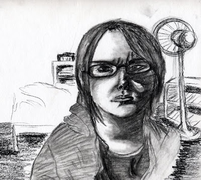
You are to do a self-portrait that looks like you but is not boring. THE RENDERING AND HANDLING SHOULD GIVE US A FEEL FOR YOUR PERSONALITY…For example, if you are more of a ‘sad’ person then capture that through lighting and perhaps even color use. No floating heads in space and you must be smart in handling of the background. You need to be creative but be careful not to get too far out there. The picture needs to be well rendered and pay attention to proper shading. You may use any media that you like…The self-portrait needs to be primarily rendered from a mirror although you can use a picture to help in getting some of the detailing correct. Size 8.5x11
1. Consider proper lighting…dramatic lighting can help to add feeling to a photograph.
2. Get the shape of the head correct and use the rules of perception to get the details correct so that the rendering looks like you.
3. VARY YOUR LINE QUALITY AND DO NOT USE CONTINUAL HEAVY OUTLINES.
4. THE BACKGROUND IS JUST AS IMPORTANT AS THE FIGURE…DO NOT IGNORE IT. Also consider placement…do you have to place yourself dead- center of the page?
The expectation was a minimum of 4 to 6 focused hours of rendering each final panel in order to create a quality product, although skill level may have meant I needed to spend more. I spent a total of 3 hours rendering the final product.
Project 3: Magazine Cut Paper Collage
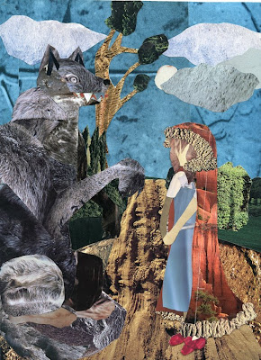
You are to pick any children’s fairy tale and you are to make a cut paper collage for a vital portion of the book.
1. You are to make all items on the page from cut paper from a magazine.
2. You need to review proper examples of what the expectation is.
3. You CAN NOT create items from items that already exist. For example, if you have a person you cannot just cut out a person or piece together a couple of people to make a ‘new person’. You need to be creative with a concern for QUALITY.
4. You must pay attention to COMPOSITION and making sure that the illustration is CLEAR AND INTERESTING. You must pay attention to the ground plains.
5. You must pay attention to color use and making sure that you do not have everything pieced together in a way that destroys the UNITY of the work. PROPER PLANNING IS KEY.
6. You must make sure that your CUTTING AND GLUING IS VERY PRECISE!
The expectation was a minimum of 4-6 focused hours rendering each final panel in order to create a quality product, although skill level may have meant I needed to spend more. I spent a total of 9-10 hours rendering the final product.
Project 4:(Line) Contour Drawing Still-Life


Warm up: Blind Contour Still Life


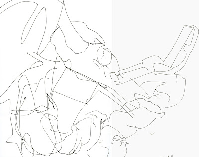
Warm up: Blind Contour Hands
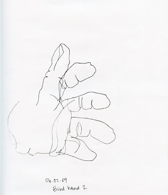
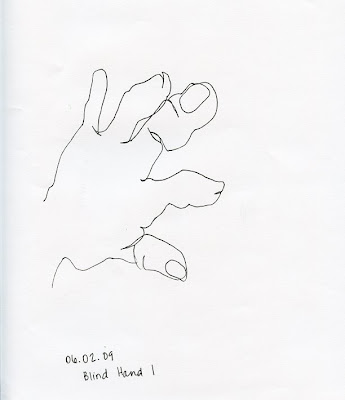
You will set up a Still-life consisting of: 1 shoe that is white in color and with flat shoe laces (the shoe should have some character to it), two socks, an INTERESTING HOUSEHOLD ITEM, and an item to be provided by me. This will be on a day of your choosing and I must be notified so that I can grade the item the day of.
1. You will do two blind contour drawings of your hand on 8.5x11 paper and SAVE these to go along with the drawing.
2. You will do four additional warm-up blind contour drawings on an 11x17 sheet of paper.
3. YOU MUST ENSURE PROPER TOOL USE AND LINE QUALITY.
4. You will set up your still-life in a way that is interesting and provides good contour/cross contour.
5. IT IS VITAL THAT YOU DO THIS PROPERLY SO THAT YOUR HAND IS MERELY AN EXTENSION OF YOUR EYE.
6. You will do TWO 40 MINUTE drawings of the same still-life on 11x17 paper with micron pens.
7. THIS IS A CONTOUR DRAWING SO ATTENTION TO DETAIL IS IMPORTANT…AND NO SHADING AT ALL.
8. You must ensure that you take care of your work for the duration.
Project 5:(Shape/Color) "The Bull"
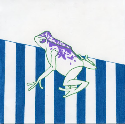
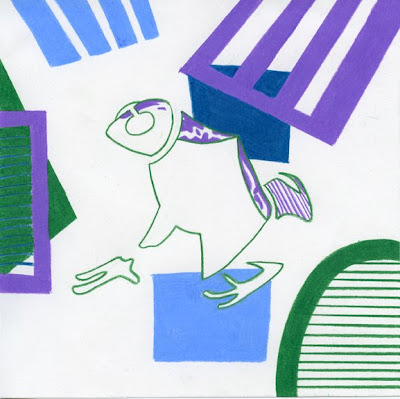
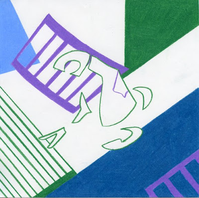
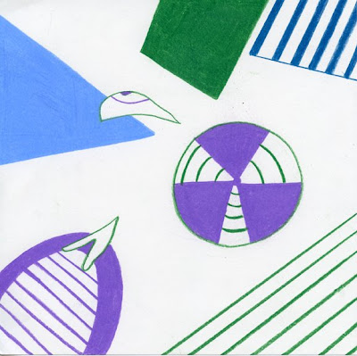
You are to set up a simple still-life of INTERESTING FRUIT AND EGGS. That means you need to go to a supermarket and look for INTERESTING FRUIT that is INTERESTING. You should have CONTRAST IN BOTH COLOR AND TEXTURE.
1. The still-life should contain THREE pieces of different fruit and TWO EGGS. You can drain the eggs by punching a small hole in the top and bottom. BE SMART ABOUT THE SETUP OF YOUR STILL-LIFE.
2. There should also be a cylinder and cube represented in some manner of the setup.
3. You need to set up a PLAIN FABRIC BACKGROUND. The items are to SIT ON PLAIN fabric as well. You should have some folds and creases in BOTH AREAS of the fabric to help establish visual interest and form.
4. You need to make sure THAT YOU HAVE A GOOD LIGHT SOURCE THAT WILL PROVIDE SHADOWS AND A RANGE OF VALUE TO HELP ESTABLISH FORM. While you are drawing your room should be fairly dark so that your light source can do the job it is supposed to.
5. You need to PHOTOGRAPH YOUR STILL-LIFE FOR APPROVAL BEFORE YOU START THE DRAWING.
6. Drawing size is 10x10.
7. You need to create a DISPLAY VALUE SCALE OF FIVE VALUES. THAT MEANS IT IS TO BE EXCEPTIONALLY NEAT AND WELL DONE AS IT WILL BE DISPLAYED UNDER THE STILL-LIFE. You should be able to identify the value ranges in your drawing.
8. PAY ATTENTION TO THE L/S INFO ABOUT LIGHT AND SHADOW.
The expectation was a minimum of 4-6 focused hours rendering each final panel in order to create a quality product, although skill level may have meant I needed to spend more. I spent a total of 3-4 hours rendering the final panel.
Project 6:(Value/Form) Still-Life, Charcoal

You are to set up a simple still-life of INTERESTING FRUIT AND EGGS. That means you need to go to a supermarket and look for INTERESTING FRUIT that is INTERESTING. You should have CONTRAST IN BOTH COLOR AND TEXTURE.
1. The still-life should contain THREE pieces of different fruit and TWO EGGS. You can drain the eggs by punching a small hole in the top and bottom. BE SMART ABOUT THE SETUP OF YOUR STILL-LIFE.
2. There should also be a cylinder and cube represented in some manner of the setup.
3. You need to set up a PLAIN FABRIC BACKGROUND. The items are to SIT ON PLAIN fabric as well. You should have some folds and creases in BOTH AREAS of the fabric to help establish visual interest and form.
4. You need to make sure THAT YOU HAVE A GOOD LIGHT SOURCE THAT WILL PROVIDE SHADOWS AND A RANGE OF VALUE TO HELP ESTABLISH FORM. While you are drawing your room should be fairly dark so that your light source can do the job it is supposed to.
5. You need to PHOTOGRAPH YOUR STILL-LIFE FOR APPROVAL BEFORE YOU START THE DRAWING.
6. Drawing size is 10x10.
7. You need to create a DISPLAY VALUE SCALE OF FIVE VALUES. THAT MEANS IT IS TO BE EXCEPTIONALLY NEAT AND WELL DONE AS IT WILL BE DISPLAYED UNDER THE STILL-LIFE. You should be able to identify the value ranges in your drawing.
8. PAY ATTENTION TO THE L/S INFO ABOUT LIGHT AND SHADOW.
Project 7:(Texture/Contrast) Contrasting Texture
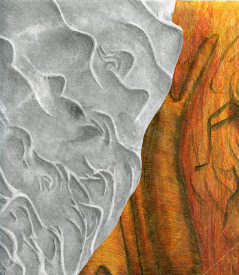
You are to find or create two strong, contrasting texture references and combine them in a way that is interesting on a 10x10 panel. You must cover the entire panel. You are to do one panel in graphite and one panel in colored pencil using the SAME TEXTURES and SAME SETUP.
1. You must make sure that your textures are STRONG TEXUTRES. Even if you create your own texture YOU SHOULD HAVE SOME REFERENCE FROM WHICH TO BASE YOUR CREATION.
2. In order to have a strong texture you need to have a good sense of FORM and and good UNDERLYING PATTERN.
3. You must SHADE APPROPRIATELY (FIVE VALUES) which means IDENTIFYING THE LIGHT SOURCE AND RENDERING ACCORDINGLY.
4. YOU ARE NOT TO HAVE LARGE GAPS OR AREAS OF EMPTY SPACE.
5. When using color you will want to be careful about color selection and technique. Burnishing may not be the best idea for this. BUILD UP COLOR WORKING FROM GENERAL TO SPECIFIC. COLOR SHOULD ENHANCE THE ITEM NOT DETRACT…SO NO HOT PINKS OR NEON TYPE COLORS.
6. Make sure to do the process for setup and ideas if you are creating your own texture. STAY AWAY FROM SEVERE PERSPECTIVE DRAWINGS OF TEXTURE.
7. BEWARE IMPROPER LINE USE.
The expectation was a minimum of 4 to 6 hours rendering each final panel in order to create a quality product, although skill level may have meant I needed to spend more. I spent a total of 4-5 hours rendering the final panel.
Project 8:(Emphasis/Space) Still-Life, Graphite
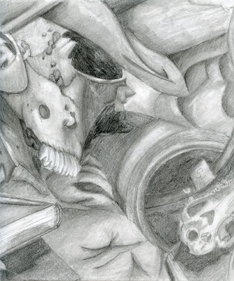
I will setup a basic still-life in the photo lab. You will select a section of the still life that will act as THE FOCAL POINT. You will properly render the still-life making sure to pay attention to PERSPECTIVE, FORM, AND OTHER RENDERING ISSUES. The size will be 10x10 on quality drawing paper.
1. We will setup two-day blocks for you to render. Only three people at a time will be allowed in the room and certain people will not be allowed to draw together.
2. If you do not complete the drawing within the two-day period YOU ARE TO COME IN ON YOUR OWN TIME (AFTER EATING LUNCH AND AFTER SCHOOL) TO COMPLETE THE DRAWING.
3. You must be careful to draw what you see and to be accurate.
4. Do NOT draw too small.
The expectation was a minimum of 4 to 6 focused hours rendering each final panel in order to create a quality product, although skill level may have meant I needed to spend more. I spent a total of 5-6 hours rendering the final panel.
Project 9:(Movement/Rhythm) Aboriginal Art, Watercolor

You are to create a panel in the style of aboriginal art that represents a real animal. YOU CANNOT USE AN ANIMAL FROM AUSTRALIA OR NEW ZEALAND. The arrangement of pattern, color use, and items on the page should give us a good sense of movement to a focal point as well as creating visual rhythm. MAKE SURE TO DO THE PROCESS TO COME UP WITH A GOOD SOLUTION.
1. CHOOSE YOUR COLORS CAREFULLY. EARTH TONES ARE TYPICALLY STRONGLY REPRESENTED COMBINED WITH OTHER COLORS IN A CAREFULLY CONSIDERED WAY.
2. Study the samples to see how shapes and patterns are utilized.
3. YOU MUST BE CAREFUL TO USE THE WATERCOLOR PROPERLY. Do not over saturate the page or the pigment. WORK SLOWLY AND CAREFULLY ALLOWING FOR DRYING TIME BETWEEN WASHES.
4. Use a GOOD H pencil to lightly draw in before painting. Some of you are using H pencils that have quality problems and youR under-drawing is TOO DARK.
5. AGAIN, STUDY THE HANDOUTS AND SYNTHESIZE WHAT IS BEING DONE WITH REGARDS TO PATTERN,COLOR, LINE USE, SHAPE, LAYOUT, ETC. The ability to produce a quality product will have a lot to do with how well you have studied examples and applied what you have learned.
Project 10:(Balance) Mask Asymmetrical, Graphite
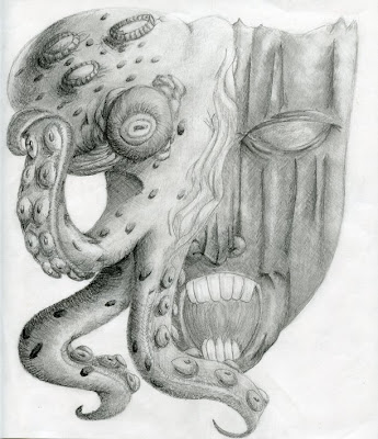
You will be creating two masks to represent asymmetrical balance and symmetrical balance. YOU WILL SHOW THE TYPES OF BALANCE USING BOTH PATTERN AND FORM on BOTH MASKS. You must have a ‘reference purpose’ for the mask. Again, these masks are NOT Halloween masks. SIZE 10X10 SQUARE.
1. The first mask will be asymmetrical using GRAPHITE. REMEMBER…You are to show asymmetrical balance in both design of the mask itself and the pattern used on the mask. YOU ARE ALSO TO SHOW A SENSE OF FORM.
2. The second mask is to show symmetrical balance using colored pencil. This type of balance is to be shown both in the design of the mask and pattern use. IT IS ALSO TO SHOW A SENSE OF FORM.
RENDERING SKILLS ARE VITAL. THE MASKS NEED TO BE CLEAN, CRISP, RENDERED PROPERLY TO SHOW FORM, AND CAREFUL CONSIDERATION IN COLOR USE AND DESIGN.
The expectation was a minimum of 4 to 6 focused hours rendering each final panel in order to create a quality product, although skill level may have meant I needed to spend more. I spent a total of 5-6 hours rendering the final panel.
Project 10:(Balance) Mask Symmetrical, color pencil
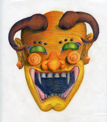
You will be creating two masks to represent asymmetrical balance and symmetrical balance. YOU WILL SHOW THE TYPES OF BALANCE USING BOTH PATTERN AND FORM on BOTH MASKS. You must have a ‘reference purpose’ for the mask. Again, these masks are NOT Halloween masks. SIZE 10X10 SQUARE.
1. The first mask will be asymmetrical using GRAPHITE. REMEMBER…You are to show asymmetrical balance in both design of the mask itself and the pattern used on the mask. YOU ARE ALSO TO SHOW A SENSE OF FORM.
2. The second mask is to show symmetrical balance using colored pencil. This type of balance is to be shown both in the design of the mask and pattern use. IT IS ALSO TO SHOW A SENSE OF FORM.
RENDERING SKILLS ARE VITAL. THE MASKS NEED TO BE CLEAN, CRISP, RENDERED PROPERLY TO SHOW FORM, AND CAREFUL CONSIDERATION IN COLOR USE AND DESIGN.
The expectation was a minimum of 4 to 6 focused hours rendering each final panel in order to create a quality product, although skill level may have meant I needed to spend more. I spent a total of 6 to 7 hours rendering the final panel.
Project 11:(Pattern) Tile Regular, Watercolor
You are to create two 10x10 tiles. One is to represent regular pattern and one is to represent radial pattern. THESE ARE MEANT TO BE DECORATIVE TILES THAT YOU WOULD FIND IN A VERY EXPENSIVE HOUSE.
1. For our intents and purposes we are dealing 2D shape to make up our pattern.
2. USE TOOLS. MAKE SURE YOU HAVE PRECISE RENDERING.
3. MAKE SURE TO USE THE PROCESS FOR PROPER PLANNING.
4. It is your choice with which tile you use watercolor and with which one you use colored pencil.
5. Be CAREFUL with any use of white space.
Project 11:(Patter) Tile Radial, Color Pencil
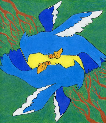
You are to create two 10x10 tiles. One is to represent regular pattern and one is to represent radial pattern. THESE ARE MEANT TO BE DECORATIVE TILES THAT YOU WOULD FIND IN A VERY EXPENSIVE HOUSE.
1. For our intents and purposes we are dealing 2D shape to make up our pattern.
2. USE TOOLS. MAKE SURE YOU HAVE PRECISE RENDERING.
3. MAKE SURE TO USE THE PROCESS FOR PROPER PLANNING.
4. It is your choice with which tile you use watercolor and with which one you use colored pencil.
5. Be CAREFUL with any use of white space.
The expectation was a minimum of 4 to 6 focused hours rendering each final panel in order to create a quality product, although skill level may have meant I needed to spend more. I spent a total of 3 hours rendering the final panel.
Subscribe to:
Posts (Atom)