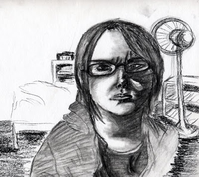
You are to do a self-portrait that looks like you but is not boring. THE RENDERING AND HANDLING SHOULD GIVE US A FEEL FOR YOUR PERSONALITY…For example, if you are more of a ‘sad’ person then capture that through lighting and perhaps even color use. No floating heads in space and you must be smart in handling of the background. You need to be creative but be careful not to get too far out there. The picture needs to be well rendered and pay attention to proper shading. You may use any media that you like…The self-portrait needs to be primarily rendered from a mirror although you can use a picture to help in getting some of the detailing correct. Size 8.5x11
1. Consider proper lighting…dramatic lighting can help to add feeling to a photograph.
2. Get the shape of the head correct and use the rules of perception to get the details correct so that the rendering looks like you.
3. VARY YOUR LINE QUALITY AND DO NOT USE CONTINUAL HEAVY OUTLINES.
4. THE BACKGROUND IS JUST AS IMPORTANT AS THE FIGURE…DO NOT IGNORE IT. Also consider placement…do you have to place yourself dead- center of the page?
The expectation was a minimum of 4 to 6 focused hours of rendering each final panel in order to create a quality product, although skill level may have meant I needed to spend more. I spent a total of 3 hours rendering the final product.
No comments:
Post a Comment